The first thing I ever designed was a business card. It had a hot pink cheetah print border, and I made it in a Barbie video game. It listed my name and occupation, which, at the ripe age of 8, I decided should be “graphic designer.” I printed them out on cheap copy paper from the family computer in my kitchen, and handed them out gleefully to classmates and family friends alike. It was barely a real card, but it did what cards have always done: introduced me, on my terms. I’d like to think they made a good impression.
Cards have always served this purpose. They’re a precursor and a stake in the ground; the cart before the horse and the name before the face. Even before the established format of an identifiable “business card” solidified, other kinds of printed cards were already using the same playbook—paper and type as a way to frame identity or make an introduction. The clearest predecessor to the business card first emerged in 17th-century France, a product of aristocrats who, after exodising from their shared lodgings at Versailles, needed a new way to maintain connection. Enter the visiting card, or calling card: a name printed plainly on a small rectangle of cardstock, left behind as a way to facilitate social get-togethers. Unlike business cards, which are typically handed off directly, calling cards were delivered when someone wasn’t home. They operated with a kind of social duplicity: a respectable way to call on a peer without actually facing rejection. The cards were for the upper class only, as they relied on staff to function; servants received the card, and the response, or lack of one, conveyed whether a future visit would be welcome. To signal that one had gone through the trouble of slumming it to deliver the card themselves, rather than through a footman, said aristocrat could dog-ear a card’s corner.
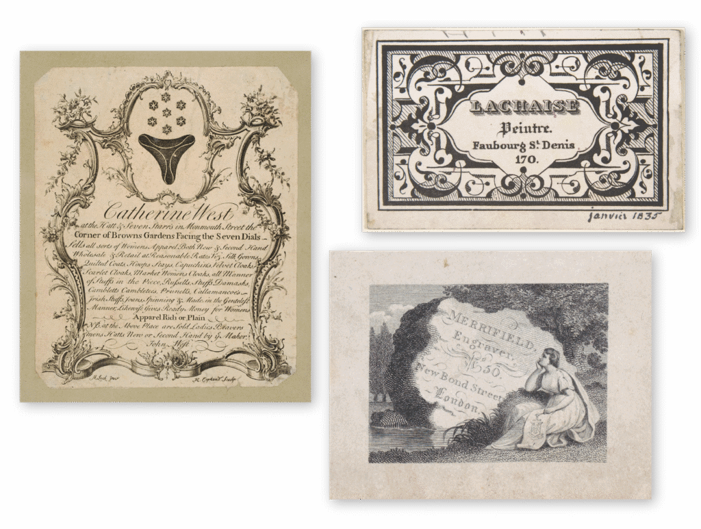
While the calling card reigned in drawing rooms, a parallel format was taking hold in public squares: the trade card. Trade cards, which emerged in 17th-century London, helped civilians navigate both the city and its new consumer economy. With street numbers still uncommon, shopkeepers printed trade cards with hand-drawn maps to their storefronts—in effect creating miniature ads that could be handed out in marketplaces, taverns, or tucked into packages. As printing became more accessible, the cards grew increasingly elaborate, covered in decorative borders, allegorical figures, and images of wares for sale. Unlike calling cards, which avoided direct exchange, trade cards were distributed publicly with zeal. They didn’t imply familiarity, but they certainly hoped to build it.
In the late 18th and first half of the 19th century, industrial printing techniques made it easier for professionals to merge the public-facing utility of the trade card with the polish and presentation of the calling card. Enter, at last, the true business card: carried by individuals rather than shops and designed for handoff rather than for house call. Emboldened by the rise of wood type, which allowed for more expressive typographic forms than lead-type, early 20th century cards mixed type styles and sizes to create layouts that felt more akin to a miniature broadside than a wedding table number.
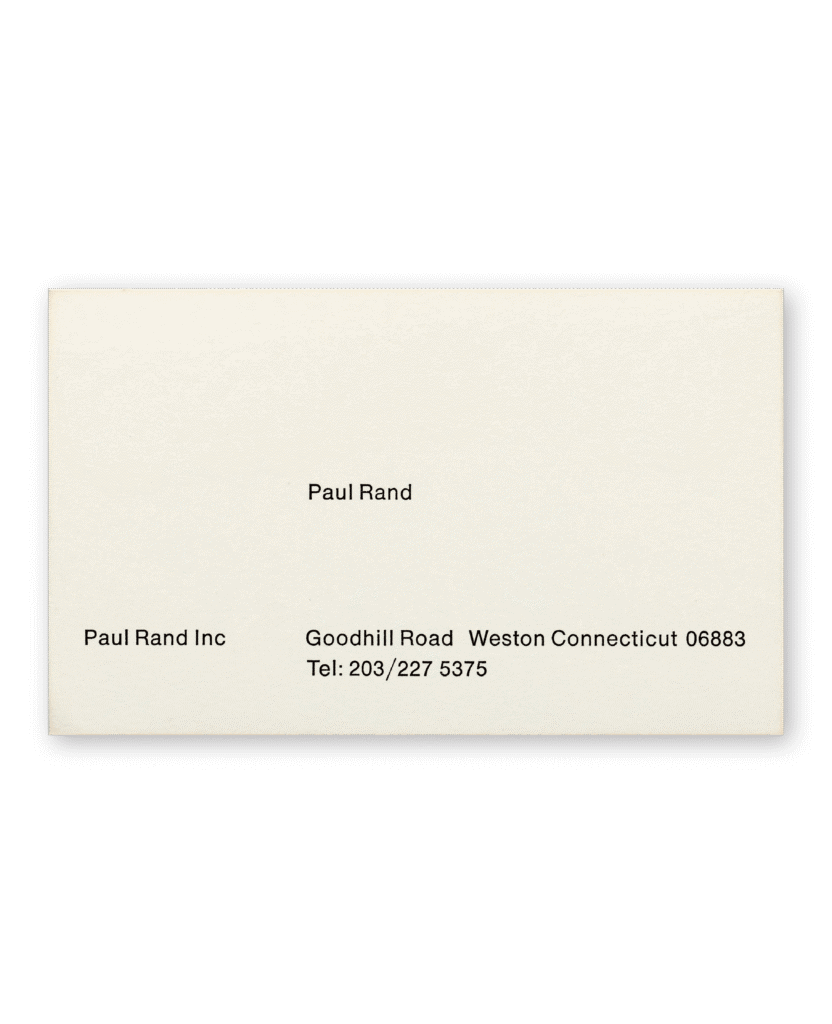
By the 1950s, Modernism had ushered in a return to restraint. Business cards, once sites of flourish and ornament, were pared back to reflect a new corporate logic of consistency, clarity, and control. The business card of Paul Rand (one of Modernism’s proudest sons) exemplifies this shift—its unadorned sans serif type and balanced columns afford no decoration beyond the grid. This approach mirrored the rise of identity systems that treated branding as a formal discipline. Under firms like Unimark and institutions like IBM, design became standardized, and the business card followed suit. Individuality gave way to uniformity—employees received nearly identical cards, with the only difference being the name swapped in. What had once been a personal token was now a component of a broader, replicable brand architecture. The card’s value wasn’t in what it said about the person, but in how precisely it fit the system.
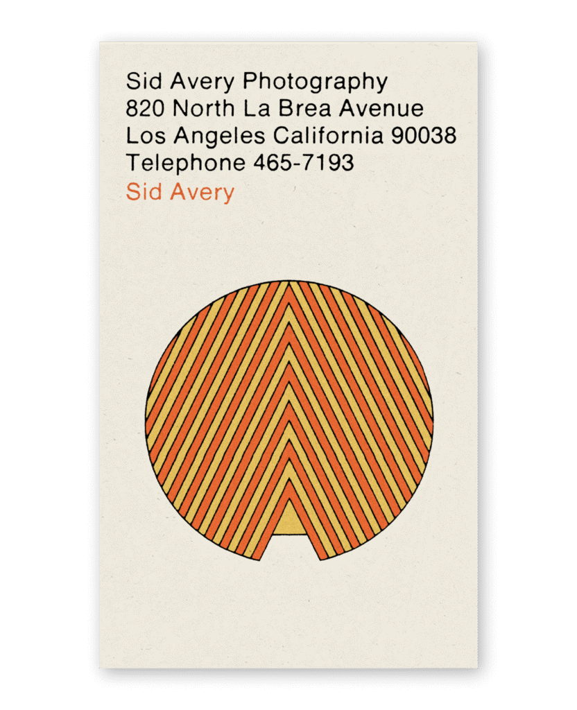
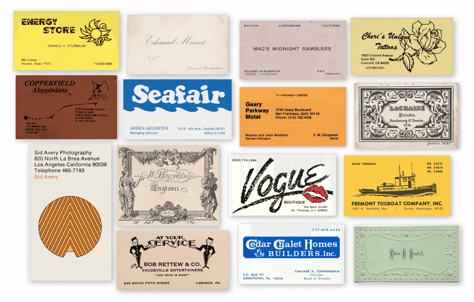
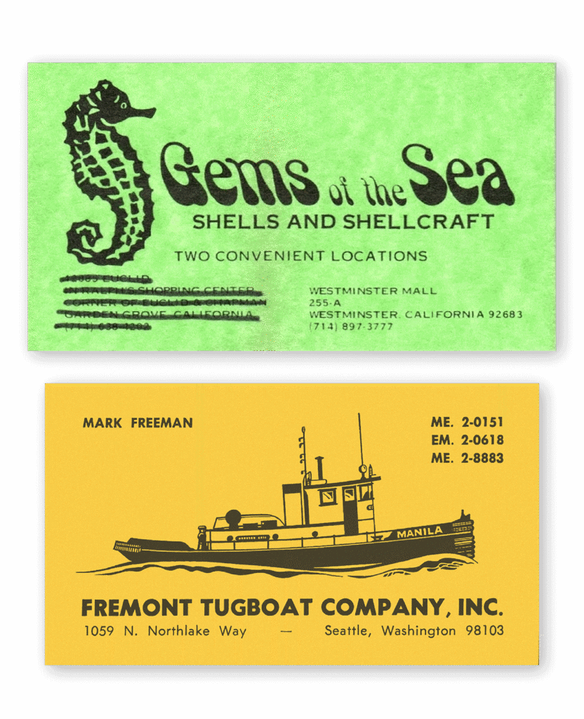
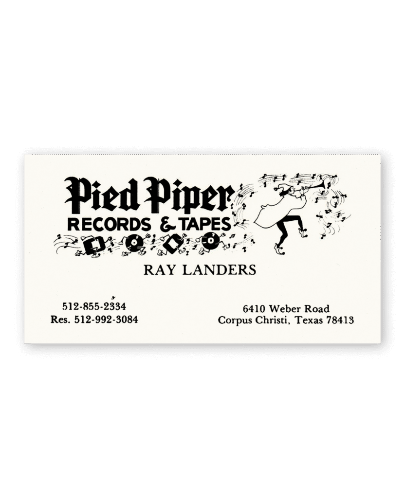
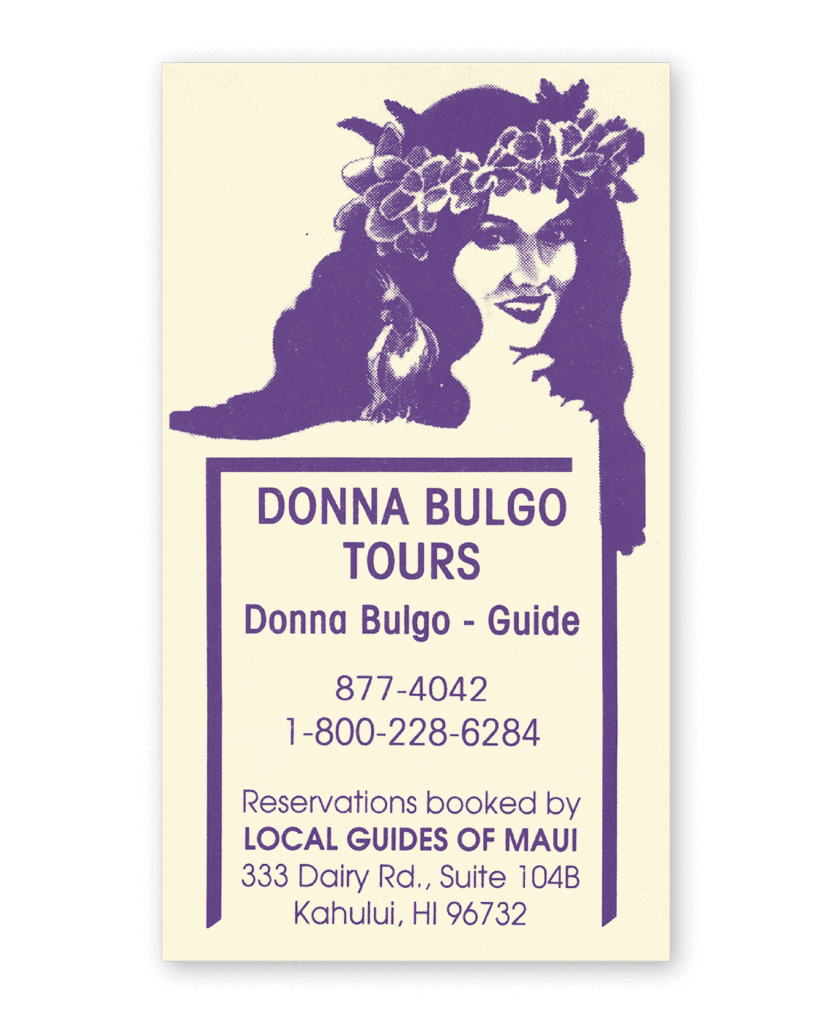
The 1960s and ’70s cracked that uniformity open. As counterculture aesthetics filtered into mainstream design, business cards got looser, weirder, and more expressive. Branding no longer required Helvetica—it could mean a hand-drawn seahorse or typography shaped like a submarine. Cards from this era often paired company names with custom logos or decorative motifs, printed on richly textured stocks in saturated colors. The rise of photolettering and clip art expanded the available typographic and illustrative palette, giving designers more freedom to reflect a business’s tone, not just its name. While earlier cards aimed for polish, these leaned into personality. A good card still signaled professionalism, but it also wanted to be remembered.
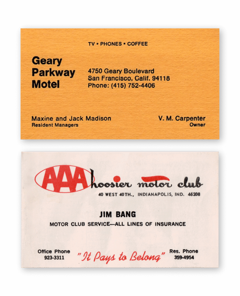
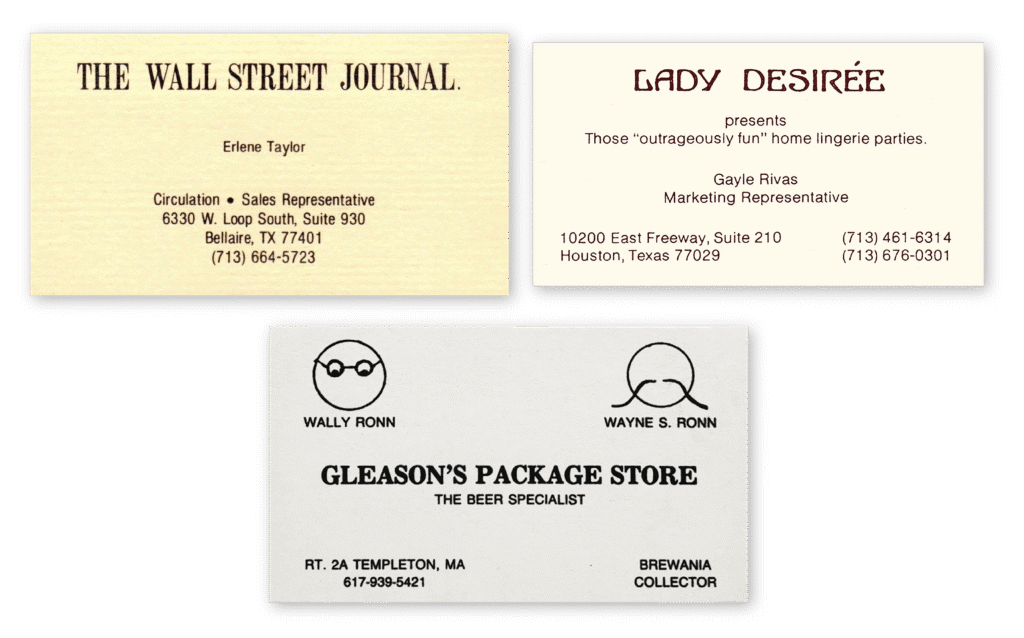
The ’90s ushered in the era of desktop publishing, and with it, a new kind of sameness. Anyone with a printer and a copy of Microsoft Word could make a business card—so they did. Out went the heavy stocks, neon ink, and custom typography; in came default fonts and centered layouts. Today, the format is functionally dead, displaced by email signatures, LinkedIn profiles, and QR codes (see also: the slow decline of paper menus, postcards, and real concert tickets). Without a practical reason to make one, the business card has become something of a fetish object. If one bothers to make one at all, it’s often letterpressed within an inch of its life and on paper thick enough to fix a wobbly table.
Obsolete or not, I hope business cards stick around as more than just niche luxury goods. At their best, they can be a totem, a way to give form to a future vision. At worst, they’re fun, low stakes things to make. Either way, everyone deserves a chance to put their name down. Especially if it’s surrounded by cheetah print.
CREDITS
Elizabeth Goodspeed is an independent designer, art director, and writer specializing in branding, packaging, and book and editorial design. She’s also the US editor-at-large for It’s Nice That and publishes Casual Archivist, a design history focused newsletter.