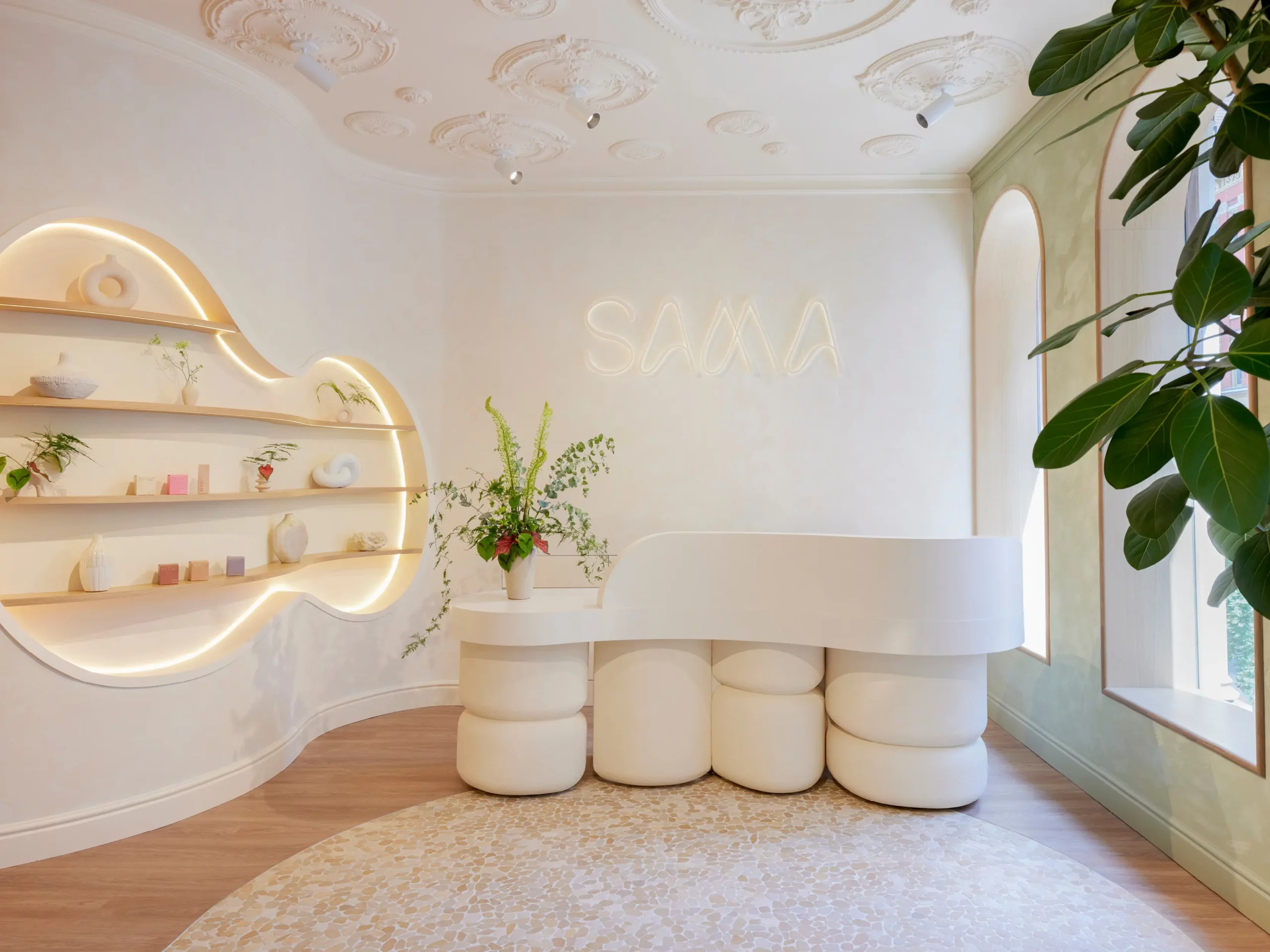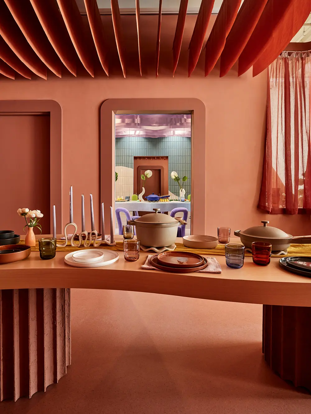
Founder and Creative Director of Ringo Studio, Madelynn Ringo, has an affinity for color. The Brooklyn-based interior designer takes a bold and imaginative approach to crafting immersive physical experiences for brands like Our Place, Studs, and Glossier.
Learn from the color aficionado as she shares tips on embracing a vast palette.
Q. What’s your favorite color and why?
My color preferences are always evolving, and maybe it’s the fall season, but right now, I’m drawn to deep burgundies, chocolate browns, and mauvy purples that feel sexy and luxurious. I find that my favorite colors and materials often shift based on my travels, my mood, or the cultural trends I’m noticing. I used to be a chrome girlie, but I’m definitely entering my burnished brass and gold era—there’s something about those metal details that adds a layer of timeless sophistication to any space.
Q. What is Ringo Studio’s color philosophy?
At Ringo Studio, we see color as a form of storytelling. Every shade carries its own emotional weight, and our philosophy is to use color not only to elevate the experience of a space but to create a system that guides and inspires. We often use color as a signifier, helping to define zones or key elements within a design, while also evoking specific emotions and creating heartbeat moments—those impactful touches that make a space unforgettable. For us, color is integral to shaping a project’s identity, energy, and rhythm, bringing both beauty and meaning to each space we design.
Q. How do you approach selecting a color scheme for a client?
We begin with moodboards to more deeply explore the client’s story and the mood they want to evoke, and from there, we take a layered approach with color and texture. Sometimes, clients come to us without a brand identity, allowing us to help shape the brand’s personality through the interior design. Other times, they bring an already established digital identity, and we’re tasked with translating those HEX codes into tactile forms—whether through tile, upholstery, or lighting—to create an immersive experience that feels cohesive and authentic.
“Going bold is about restraint—it’s knowing when to let color make a statement and when to let it breathe.”
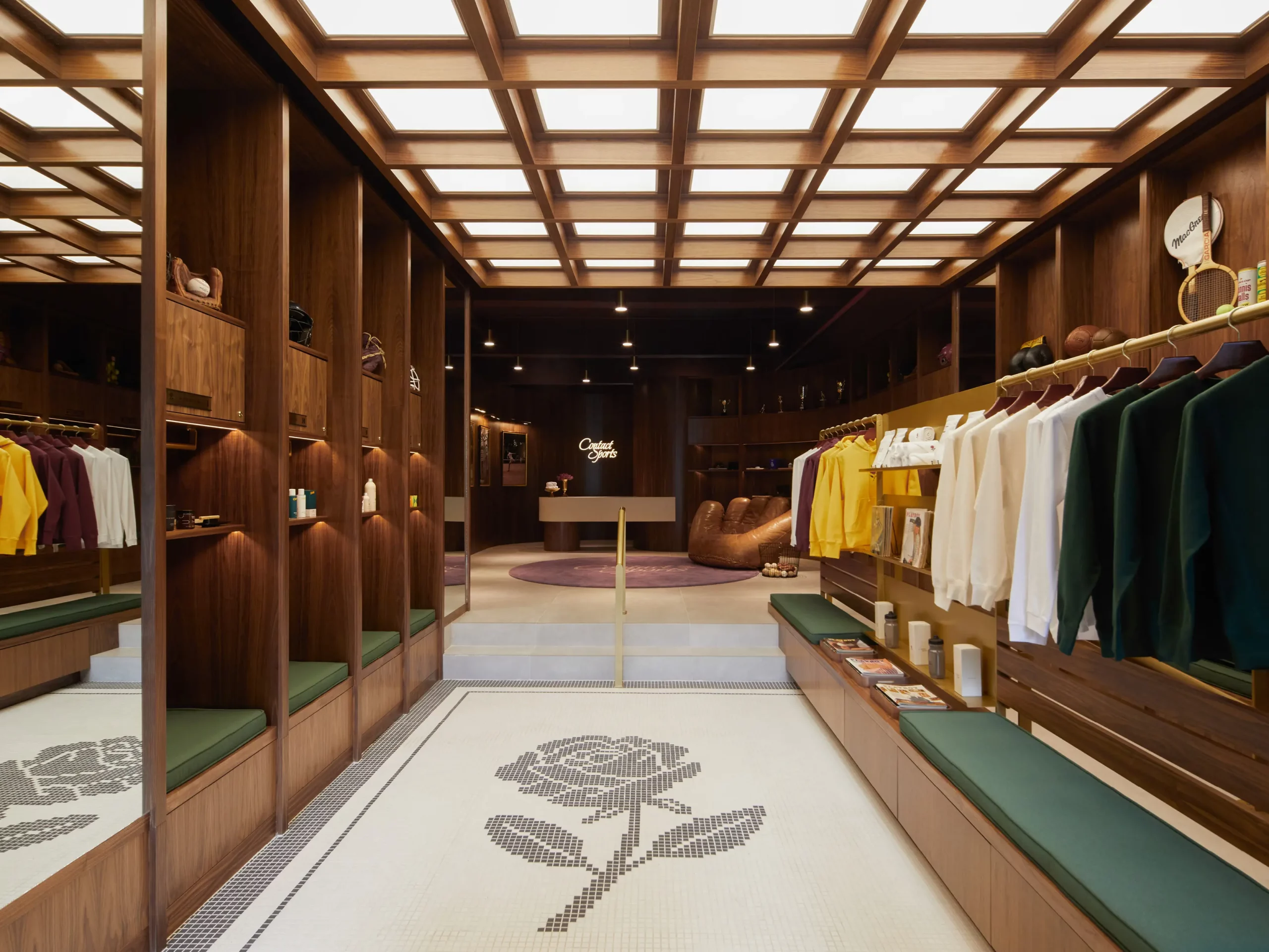
Q. How do you ‘go bold’ without overdoing it?
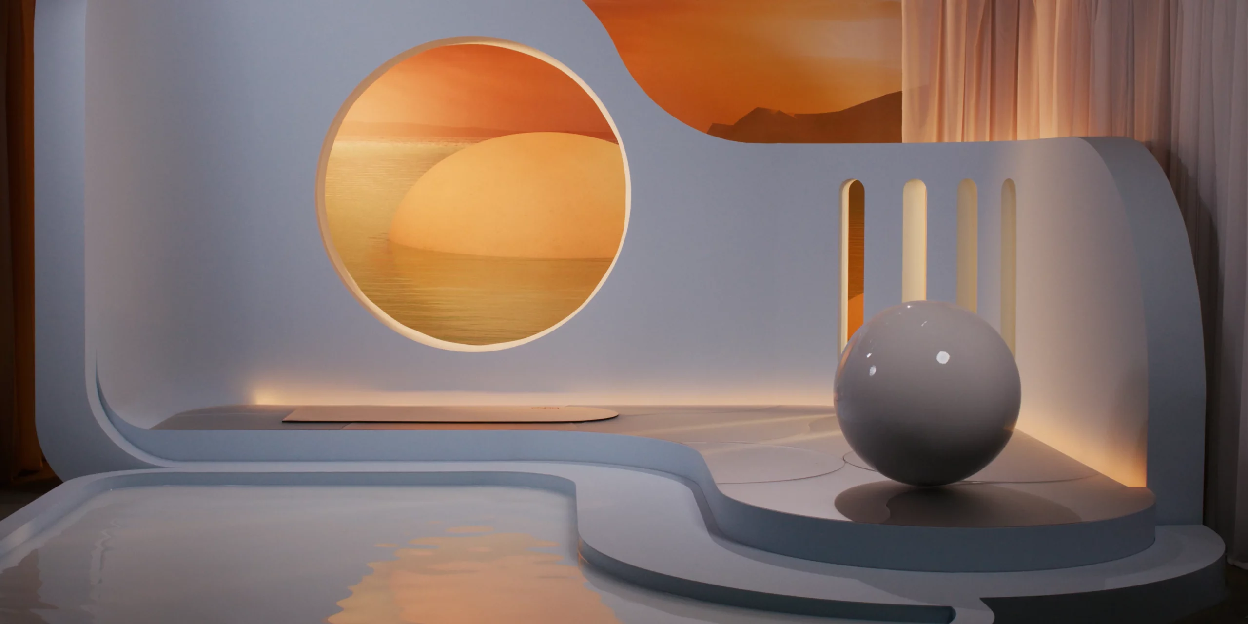
Going bold is about restraint—it’s knowing when to let color make a statement and when to let it breathe. In retail design, we carefully consider the merchandise and products so that our color choices enhance, rather than overpower, the displays. This might mean using bold colors strategically on focal points, like a feature wall or custom furniture, while grounding these with neutral tones to keep the space balanced and cohesive. When color translates to architectural materials, it takes on a deeper dimension. For example, using natural terracotta tile creates a rich, earthy boldness without the intensity of an orange painted wall. Or a heavy chartreuse velvet drapery, with its ripples catching the light, brings tonality and depth that an accent color alone couldn’t achieve. It’s about letting color complement the space and the products, crafting moments that feel intentional, layered, and rich with texture.
Q. Tell us about a current or recent Ringo Studio project that excites you.
We’re currently working on an exciting milestone project with Steve Madden, redesigning their flagship store in Times Square. It’s a unique opportunity to collaborate with a heritage brand that has such a strong New York legacy, and it’s thrilling to bring fresh energy to their space in such an iconic location. Additionally, we’re working on the interior of a social club, a typology I find increasingly important. In a world dominated by digital interaction, physical social spaces offer a genuine connection that many people are craving. Both projects reflect our studio’s commitment to creating immersive experiences that respond to the cultural moment while celebrating the spirit of each brand.
